Research: The History Of The Album Cover
The first disc records, ones that we would recognise as such, appeared around 1910. Most often these were packaged in plain brown paper or cardboard sleeves. Occasionally and enterprising retailer would print his store name on the sleeve but generally they were unadorned.

In the early 1920's retailers started gathering many of these cardboard sleeves and binding them together with heavy paperboard or leather covers. These looked similar to large photo albums and, borrowing the name, were sold as record albums. These albums offered much greater protection for the discs than the original packaging and were seen as indispensible to disc owners that had seen too many of their fragile records broken.

Beginning in the 1930s the record companies started using these record albums to distribute bundles of records from one performer or a collection of performers with similar musical styles. Some of the first cover designs can be traced to these albums and the record company’s desire to graphically communicate the music each album held.
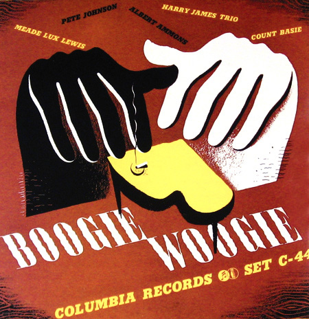
Alex Steinweiss the art director for Columbia Records is given credit for the concept of modern cover art. He experimented with different concepts and images through the late 1930s and into the early 1940s. During this time Columbia Records rebounded from the terrible years they had suffered during the depression to become one of the most prominent record companies in the United States. Much of this was due to their ground breaking use of graphical design. By the close of the decade all major recording companies had graphic design professionals on staff.

The golden era of cover art design began in the early to mid 1960s and lasted into the early 1980s. During this time the major format for music was the 12 inch, long play disc or LP. Cover art became a part of the musical culture of the time. Often used to express graphically the musician’s artistic intent, it helped connect and communicate to listeners the message or underlying theme of the album.

Designers, photographers, and illustrators sometimes became famous for their cover art creations. Such notables as Andy Warhol and Frank Frazetta were taken from being known in their industry to becoming household names due to their cover art graphic design work. So respected and desired are the designs and illustrations found in cover art that there are numerous art galleries that specialize in helping collectors find rare album covers.

As the medium for recording transitioned from the LP to the compact disc many graphic designers failed to transition with it. Having worked for so long with the much larger canvas of the LP cover, switching to the smaller CD case left most designers dissatisfied with their results. Often artist and record companies simply tried to shrink the LP size art to fit the CD.


Album cover art, now almost exclusively CD and CD packaging artwork, went through a period of change and rebirth in the 1990s. Designers learned to capture snapshots and portions of the artist’s musical intent rather than trying to convey the entire message. Also designers started conveying the emotion of the music rather than the musical intent.

In the late 90s computer design programs started to overcome the physical limitations of the smaller CD packaging. With the ability to draw much tighter, finer lines and have even small details look crisp and sharp, once again designers were free to explore a larger variety of design options. As the technology continued to improve graphic designers adapted and were once again producing world class artwork.


In the present, CD design is undergoing a true renaissance. Rather than becoming obsolete in the digital age as many thought it would, graphic design is once again proving itself as the difference maker. The internet is now the largest record store imaginable. Now rather than browsing a few hundred albums or songs at a time you may be exposed to thousands and thousands. Since it would be impossible to listen to portions of all those thousands of songs the design of the accompanying artwork must cause potential listeners to stop and take notice and give this album a try.


Research: Existing Digi Packs


From this research, I have learned that the reoccurring colour scheme is either black and white or creams. This may be to illustrate the genre style of Folk Rock.
I have also learned from this research that there is always the artist on the front or the back of the digipack and the artist has a serious look on their faces. This could illustrate the tone in which the songs are, essentially showing their innermost feelings on an issue or personal experiences.
It could perhaps highlight the controversial topics that could be broached in some of the lyrics or in the album title itself. An example of an artist who does this is U2, and their album 'War' and their 1983 song 'Bloody Sunday', or even perhaps the artis Chumbawamba and their song 'Thubtrumping'. Each song highlights a particular issue or topic they believe should be spoken out against.
An example related to my genre, however, is The White Buffalo's song 'Oh Darlin, What Have I Done?' which connotes to someone who has committed a murder.
Example 1


I liked the outcome of this digipack, however, I used the image in the making of my music magazine advertisement, so I decided to try something else.
Example 2


In the end, I decided that I did not like the outcome of this digipack as It looked to plain and it didn't stand out to me.
Final Piece


In the creating of my final piece, I was experimenting with layers. That was how I had gotten the effect of the actor, I decided that I liked it, and chose to keep it. I decided to use a wooden effect on the separate panels to add a more rustic and folk vibe to the Digipack.